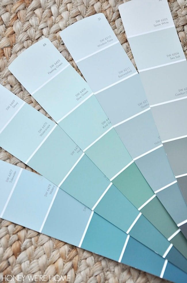
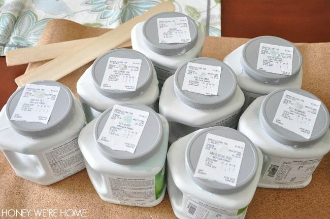
How many samples of paint does it take to find the right color for a dining room? Apparently, at least eight. I’ve been to the paint store three times in the past three days to continue testing paint samples, and I’m not even sure I have a winner yet! I’m determined to decide today though because Sherwin Williams is having their 40% off sale and I want to take advantage of it! (It ends Monday).
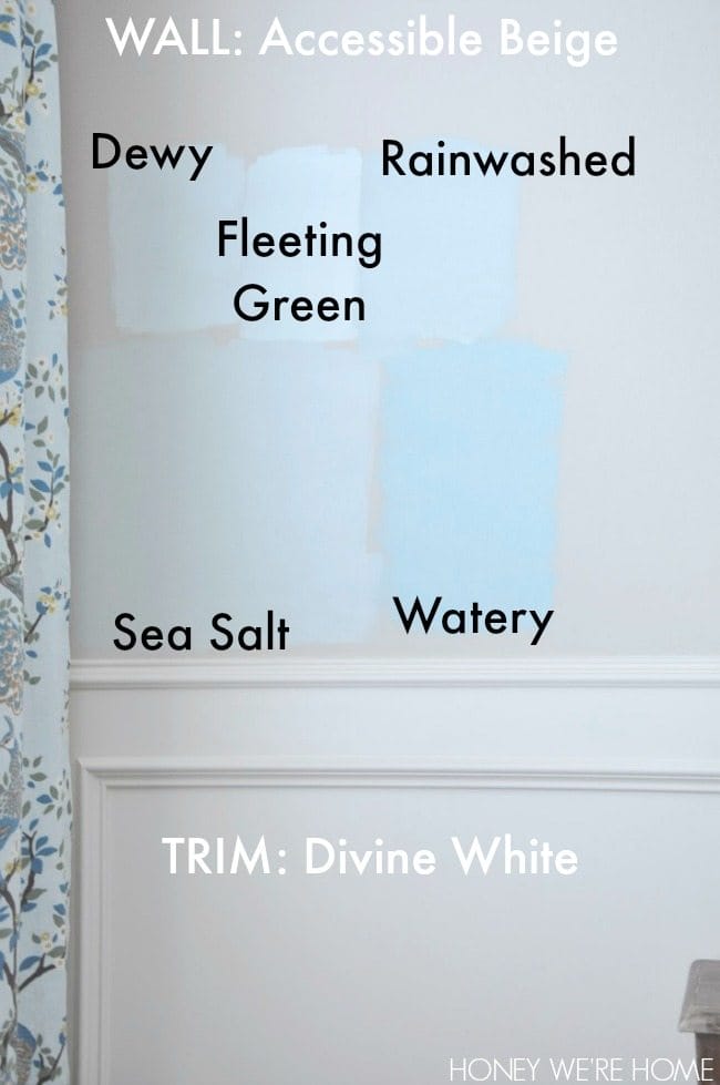
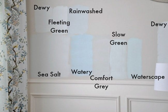
I fell in love with Sherwin Williams Sea Salt after seeing it on Life on Virginia Street, in Sarah’s master bedroom. In her room, SEA SALT looked like a very soothing grayish-green. I thought that would go well with my dining room drapes and the rest of the house. I’m looking for something soft that will brighten my room from the duller ACCESSIBLE BEIGE and look good when I change out the accessories in the room throughout the year. I like the Accessible Beige pretty well in the rest of our first floor, and I hesitated to change the dining room because I want a cohesive look, but I figured I can find a paint that goes well with the rest of the downstairs since this room is pretty much off on it’s own. I’m not necessarily looking to match the drapes; rather, I’d prefer a complimentary color.SEA SALT is pretty, but it looks way more blue than green and a little dull in my room. Still a contender though. Will be so funny (not really) if I end up with this one after painting all the other colors on my walls. It’s the first one I put up.
WATERY was too bright. Looked so gorgeous on the swatch.
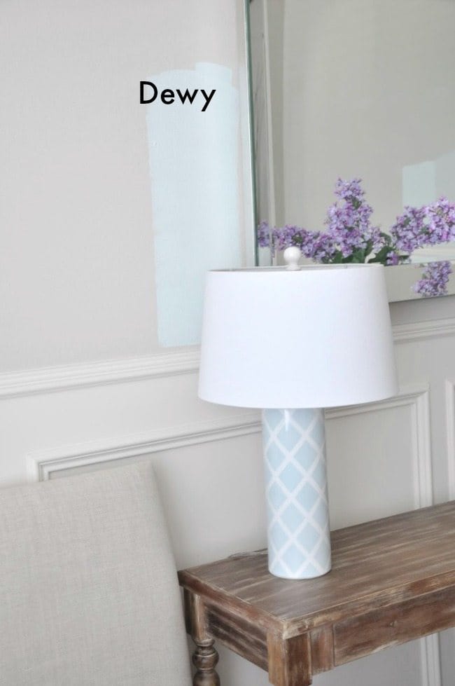
DEWY is nice, close to the color of the lamps I have in the now, but it’s pretty white against the creamy wainscoting.
FLEETING GREEN is just a tad darker than DEWY.
RAINWASHED is too blue and bright.
But, it’s difficult to judge paint colors by a photograph online, or heck, even on a swatch. I swear the Sea Salt that’s on the swatch looks much more green than it does on the wall, where it reads blue.
Also, I was painting the colors on top of our existing wall color, not primed walls.
Our trim is a creamy white (DIVINE WHITE), so some of the blueish colors would probably look better against a crisp, white trim.
Colors look different at different times of the day. The three pictures below were taken in the afternoon.
Then, I went back for three more. These pictures were taken in the evening.COMFORT GREY – hard to tell in the picture, but this is a pretty pale olive/greenish color. It’s a contender. I looks good as you peek though to the breakfast room and see the drapes there.
SLOW GREEN – pretty white.
WATERSCAPE – too bright/aqua.
Now my walls are all crazy with these paint swatches everywhere! I’m going to look again in the morning light- the last three swatches I photographed while still wet. I don’t want to do a bold, bright color in here because that wouldn’t flow with the rest of the house, so I’m trying to find the best color that will brighten up the room, but still be soothing. What do you think??
Hi friends! Well that was a weird Monday Tuesday, right?! I feel all discombobulated now! You too? It must be Wednesday because that’s when I share the best sales with…
Hi friend! How’s your week going? We’re on the downhill slide to Christmas break now. My 6th grader is finishing up midterm exams and we’ve got teacher gifts ready to…
I’ve been searching everywhere for a healthy banana bread recipe and found one at Half Baked that looked pretty healthy because it contained no sugar or oil and uses whole wheat flour….
Hi friends! I’m getting so excited about a new home decor project! If you follow me on Stories, you know that I’m having the exterior of my house painted! I’ve…
Amen it’s Friday!! It’s been a long week here, and I’m really looking forward to the weekend:) Today, I’ve got a super simple, quickie project for ya. I spelled James’…
Since we seem to spend the most time in the living room, (and especially on the couch), I thought it would be a good place to start- decor wise. I…
Meet Megan
Hi! I’m Megan, mom to a thoughtful teenager and spunky young girl. We call Houston home and recently moved into our dream home. I traded my lawyer hat to become a full-time blogger in 2010. I love sharing my passion for affordable fashion, home decor, organization, & fitness to help inspire you to take care of you!
51 Comments
I understand your dilemma. I recently went through a similar scenario and even ended painting almost an entire room the wrong color even after going through four of five swatches on the wall. My house is spiced vinegar which is very beige. I thought I wanted to go with something very similar to your dewy or fleeting green but when I got it up, it just looked way too cool next to the warmer toned beige on the adjacent wall. I ended up going with a warmer hued blue. It really isn't similar to any of your other choices but if I were picking from your choices, knowing your other walls are accessible beige, I would go with the warmest of the colors, probably either sea salt or rainwashed. I hope that helps!
I came across this old thread and it caught my eye because of your creamy colored trim. I just bought a house that has this cream trim everywhere…cabinets. doors trim etc. It is throwing me off for sure. I wish it was white but I am trying yo cut costs, not to mentio. The trim is in great condition. Any suggestions on a color throughout with maybe a color like sea salt in the master or dining? I lean more towards greens, teal, blue colors.
The best way to judge the true color is to paint a piece of white poster board with at least two coats to get a true color. That way you can move it around the room during the day/evening to see it in different light.
Simply LKJ, I completely agree! Heads up – Home Depot has a little product less than $5, you paint this swatch and it will stick and you can lift it up and reapply to another room or simply another area of the room.
Choosing paint colors can be so hard! I also recommend Simply LKJ's tip about using the painted poster board. It really does help to be able to move the color around the room throughout the day. From the pictures you have shared I would choose Sea Salt. It looks soothing, adds a bit of color, but isn't overwhelming. Can't wait to see what you finally pick!
I feel for you Megan! We went through the same thing recently and had so many swatches on the wall. It's funny how the paint chip looks perfect or I'd seen the color in someone else's home and liked it but on our wall it changed so much with lighting, time of day, etc. We took a few days to live with the swatches to decide. A thought…Have you tried Pale Oak by Benjamin Moore? It's really a gorgeous modern neutral color, a very soft gray that seems to work with anything. Courtney used it in her bedroom. We have in our guest room and I love the color. It's a favorite of mine.
I would go with either Sea Salt or Comfort Grey…the others are just too much 'color' for myself. And color scares me sometimes. But I'm sure whatever color you choose, it is going to look awesome.
I think you need to invest in a sherwin Williams paint wheel so you have all the colors in front of u to compare! I just painted our home office oyster bay. Happy painting! -Amy
I vote for Sea Salt! My local Sherwin Williams allowed me to purchase paint non-tinted during their 40% off sale. So I stocked up on a few gallons and have them tinted when I finally decide on a color. Something to think about trying if you are still on the fence today 🙂
I've found that it's easier to see a paint sample's true color if I view it against a neutral backdrop (i.e., primer). It really changes the look of the color, as opposed to looking at it against the current wall color, if that makes sense. I used this approach when choosing a gray for my husband's office – http://evolutionofstyleblog.blogspot.com/2013/05/picking-perfect-shade-of-gray.html
Here's my vote – Sea Salt or Comfort Grey are winners in my book! Sea Salt looks like such a soothing color, maybe its also the name that does it for me! lol 🙂 But also totally digging Comfort Grey, if you don't use it in there for sure find another place for it!
I vote for Sea Salt. It's so funny that you have Accessible Beige. That was the ONLY color my husband and I could agree on when we were picking out paint for our house. It is so… well… greige. Its smart that you are looking at your paint from all sort of light – I've made the mistake of picking paint when it was bright out and hating it when it was nighttime. Good luck with your choice!1
We have rainwashed in our bedroom (had in our old house and new). It was way more gray in our old house, and much more like the swatch in our new house. It is very complimentary to so many accent colors, but everyone's space changes a paint color! I think whatever you pick will be beautiful! Though sea salt seems to have the right mix of gray/blue/green:) And agree with the white poster board, we did that at our new house and was so much more helpful!
I have sea salt in my bedroom and LOVE it. I live in an older home though, with original stained wood trim, and it was really hard for me to find colors I like with the wood trim. Sea Salt was a huge winner as the room has stained glass windows so Comfort Gray was too dark. I like both of those options in your dining room. My favorite thing about Sea Salt is how it changes colors in the light–sometimes it looks green, then blue, then gray. All are lovely though!
I think that comfort grey looks a lot like the color you have in there now. (at least online it does. I am sure it looks different in person.) I vote for sea salt. It looks pretty with your drapes and molding! 🙂
I had the exact same dilemma for my master bedroom! Tried Sea Salt, Comfort Gray, Rainwashed. None of them were what I wanted. Then I came across an old post from The Lettered Cottage where she mentioned an old Martha Stewart for SW color called Blue Hubbard. SW still has the formulas in their system, so I got a sample and I knew immediately it was the one. Go get it. I promise you will not regret it
My entire first floor is accessible beige which I actually chose after reading your blog. We have a smaller eat-in kitchen so I painted the wall behind the table sea salt to separate the area from the rest of the kitchen. The trim is a brighter white and it shows as a beautiful light sea green and not blue at all.
It's hard to see the paint colors on my monitor to know. Sherwin Williams Misty is a nice soft blue/gray that might work in your house. You can google it to see some images.
Instead of the samples, I'd hold the paint chips up on the wall-you'll eliminate 95% in 5 minutes. Then tape your top 5 on the wall and look at them at different times of the day-you'll have your final 2 in 24 hours and you can try them on the wall.
A simple way is to take an accessory in the room that you love and match the paint color to that-that way you'll know it will work. Good luck.
I think "rainwashed" will give you a fresh look, still blend all your decor (curtains, rug, lamp), while the other colors except 'watery' seem very similar to what you already have. CONNIE
Giiiiirl you are on my swatch. Love both those colors. My kitchen was painted sea salt at my last house. With light it DEFINITELY reads blue. In the evenings it would be a pale grey. I tried a test area at my new condo kitchen with sea salt and because the light is low it always read grey. I had comfort grey in my bedroom and I loved it. It definitely reads more green. It was the perfect greeny grey. I decided to try restoration hardware's silver sage in my new bedroom and to be honest I really miss the comfort grey. Here is a link if you want to see the colors in my old space. Honestly though, I don't think you can go wrong. And if alleviates any stress… you can buy a gallon of white paint at 40% off and then when you decide on the tint, you can go back and they will add the colorant for you at a future time. http://www.zillow.com/homedetails/3417-N-Henderson-Way-Clarksville-TN-37042/41829949_zpid/
I really liked the "Waterscape" color with your room. All of your decorations seem to match that shade best. I don't blame you at all for looking at so many different colors of paint. I always bring home at least three different swatches to test out.
I see this post is old and you've probably already decided on a colour by now. I am searching also for the perfect coastal calm green and wandered upon your post on Pinterest. You've probably already selected a colour…but if not, consider Contented or Filmy Green by Sherwin Williams. Sea Salt was too blue for me too.
I just spent hours driving from Home Depot to Sherwin Williams and have multiple paint cans. Oh, I feel better now you have eight and I was frustrated with my three! So far for my bright, super bright sun filled upstairs bedroom rainwash is my choice. Will keep you posted.
So….which color did you decide on? After all this time has passed, do you love it? (I'm trying to decide on an exterior color, which is now accessible beige!)
So funny!!! I just painted my family room and kitchen the mindful grey and did the 15% on ceiling. I am loving the change. I had built ins painted Dove White. And had the master painted rainwashed. Perfect for the bedroom!
I had a sample of sea salt and comfort gray on the wall of the master bathroom. In the daylight I liked comfort gray. At night I liked Sea Salt. I just couldn’t decide and even though there is only one shade difference, there is quite a bit of difference. I decided to mix Sea salt and comfort gray (half as much comfort gray) to get a blend between the two. My husband questioned my sanity at first, but then agreed we liked both, but sea salt was a little too light and comfort gray was a little too dark. Hope it goes ok. Here we go!


I understand your dilemma. I recently went through a similar scenario and even ended painting almost an entire room the wrong color even after going through four of five swatches on the wall. My house is spiced vinegar which is very beige. I thought I wanted to go with something very similar to your dewy or fleeting green but when I got it up, it just looked way too cool next to the warmer toned beige on the adjacent wall. I ended up going with a warmer hued blue. It really isn't similar to any of your other choices but if I were picking from your choices, knowing your other walls are accessible beige, I would go with the warmest of the colors, probably either sea salt or rainwashed. I hope that helps!
That creamy trim is throwing things off for sure. I do not want to buy another swatch!!! I'm hoping to pick between what I already have up.
I came across this old thread and it caught my eye because of your creamy colored trim. I just bought a house that has this cream trim everywhere…cabinets. doors trim etc. It is throwing me off for sure. I wish it was white but I am trying yo cut costs, not to mentio. The trim is in great condition. Any suggestions on a color throughout with maybe a color like sea salt in the master or dining? I lean more towards greens, teal, blue colors.
Thank you in advance!
Kelli
The best way to judge the true color is to paint a piece of white poster board with at least two coats to get a true color. That way you can move it around the room during the day/evening to see it in different light.
Now you tell me! 😉
Simply LKJ,
I completely agree! Heads up – Home Depot has a little product less than $5, you paint this swatch and it will stick and you can lift it up and reapply to another room or simply another area of the room.
Definitely the sea salt and you can lighten it as well!
I may do that! Thanks for weighing in- sometimes you need to hear other opinions!
I gotta go with Sea Salt! I really think it looks pretty- it is a contender for my powder room too:)
Thank you!!
Choosing paint colors can be so hard! I also recommend Simply LKJ's tip about using the painted poster board. It really does help to be able to move the color around the room throughout the day. From the pictures you have shared I would choose Sea Salt. It looks soothing, adds a bit of color, but isn't overwhelming. Can't wait to see what you finally pick!
http://www.imperfeclywonderful.com
I feel for you Megan! We went through the same thing recently and had so many swatches on the wall. It's funny how the paint chip looks perfect or I'd seen the color in someone else's home and liked it but on our wall it changed so much with lighting, time of day, etc. We took a few days to live with the swatches to decide. A thought…Have you tried Pale Oak by Benjamin Moore? It's really a gorgeous modern neutral color, a very soft gray that seems to work with anything. Courtney used it in her bedroom. We have in our guest room and I love the color. It's a favorite of mine.
I love the Sea Salt! I have it in my office and it is sooo soothing and pretty:)
I would go with either Sea Salt or Comfort Grey…the others are just too much 'color' for myself. And color scares me sometimes. But I'm sure whatever color you choose, it is going to look awesome.
I think you need to invest in a sherwin Williams paint wheel so you have all the colors in front of u to compare! I just painted our home office oyster bay. Happy painting! -Amy
I definitely like the sea salt
I like the sea salt!
Just popping in to say that you can buy paint from SW and then tint it later, if you don't decide.
I do this all the time. I can never decide on paint when it comes to my own home. I really like Sea Salt and Slow Green.
Love the look of either dewy or rainwashed. They look perfect!
Sea salt all the way!
I vote for Sea Salt! My local Sherwin Williams allowed me to purchase paint non-tinted during their 40% off sale. So I stocked up on a few gallons and have them tinted when I finally decide on a color. Something to think about trying if you are still on the fence today 🙂
I've found that it's easier to see a paint sample's true color if I view it against a neutral backdrop (i.e., primer). It really changes the look of the color, as opposed to looking at it against the current wall color, if that makes sense. I used this approach when choosing a gray for my husband's office – http://evolutionofstyleblog.blogspot.com/2013/05/picking-perfect-shade-of-gray.html
I do love Sea Salt though – it's a great color!
I vote for sea salt I can see it looking great with any decor throughout the year
Here's my vote – Sea Salt or Comfort Grey are winners in my book! Sea Salt looks like such a soothing color, maybe its also the name that does it for me! lol 🙂 But also totally digging Comfort Grey, if you don't use it in there for sure find another place for it!
I vote for Sea Salt. It's so funny that you have Accessible Beige. That was the ONLY color my husband and I could agree on when we were picking out paint for our house. It is so… well… greige. Its smart that you are looking at your paint from all sort of light – I've made the mistake of picking paint when it was bright out and hating it when it was nighttime. Good luck with your choice!1
We have rainwashed in our bedroom (had in our old house and new). It was way more gray in our old house, and much more like the swatch in our new house. It is very complimentary to so many accent colors, but everyone's space changes a paint color! I think whatever you pick will be beautiful! Though sea salt seems to have the right mix of gray/blue/green:)
And agree with the white poster board, we did that at our new house and was so much more helpful!
Sea Salt gets my vote!
I have sea salt in my bedroom and LOVE it. I live in an older home though, with original stained wood trim, and it was really hard for me to find colors I like with the wood trim. Sea Salt was a huge winner as the room has stained glass windows so Comfort Gray was too dark. I like both of those options in your dining room. My favorite thing about Sea Salt is how it changes colors in the light–sometimes it looks green, then blue, then gray. All are lovely though!
I think that comfort grey looks a lot like the color you have in there now. (at least online it does. I am sure it looks different in person.) I vote for sea salt. It looks pretty with your drapes and molding! 🙂
I had the exact same dilemma for my master bedroom! Tried Sea Salt, Comfort Gray, Rainwashed. None of them were what I wanted. Then I came across an old post from The Lettered Cottage where she mentioned an old Martha Stewart for SW color called Blue Hubbard. SW still has the formulas in their system, so I got a sample and I knew immediately it was the one. Go get it. I promise you will not regret it
I also like Sea Salt and Comfort Gray best. It is hard to tell which one based on the photos. Good luck – can't wait to see the end result.
Oh my you are busy! haha! I like the Sea Salt in your pics! Good luck choosing 🙂
My entire first floor is accessible beige which I actually chose after reading your blog. We have a smaller eat-in kitchen so I painted the wall behind the table sea salt to separate the area from the rest of the kitchen. The trim is a brighter white and it shows as a beautiful light sea green and not blue at all.
It's hard to see the paint colors on my monitor to know. Sherwin Williams Misty is a nice soft blue/gray that might work in your house. You can google it to see some images.
Instead of the samples, I'd hold the paint chips up on the wall-you'll eliminate 95% in 5 minutes. Then tape your top 5 on the wall and look at them at different times of the day-you'll have your final 2 in 24 hours and you can try them on the wall.
A simple way is to take an accessory in the room that you love and match the paint color to that-that way you'll know it will work. Good luck.
I think "rainwashed" will give you a fresh look, still blend all your decor (curtains, rug, lamp), while the other colors except 'watery' seem very similar to what you already have. CONNIE
I like the sea salt the most, but also understand your dilemma 🙂
Steam carpet cleaners Fulham
Giiiiirl you are on my swatch. Love both those colors. My kitchen was painted sea salt at my last house. With light it DEFINITELY reads blue. In the evenings it would be a pale grey. I tried a test area at my new condo kitchen with sea salt and because the light is low it always read grey. I had comfort grey in my bedroom and I loved it. It definitely reads more green. It was the perfect greeny grey. I decided to try restoration hardware's silver sage in my new bedroom and to be honest I really miss the comfort grey. Here is a link if you want to see the colors in my old space. Honestly though, I don't think you can go wrong. And if alleviates any stress… you can buy a gallon of white paint at 40% off and then when you decide on the tint, you can go back and they will add the colorant for you at a future time.
http://www.zillow.com/homedetails/3417-N-Henderson-Way-Clarksville-TN-37042/41829949_zpid/
Definitely do Sea Salt! I've used it in my last 3 houses and LOVED it!!
Sea Salt
Sea Salt!!! Now you have me reconsidering my dining room walls.
Sea Salt. Definitely Sea Salt. Even the name…I love.
I really liked the "Waterscape" color with your room. All of your decorations seem to match that shade best. I don't blame you at all for looking at so many different colors of paint. I always bring home at least three different swatches to test out.
http://www.koontz.com
I see this post is old and you've probably already decided on a colour by now. I am searching also for the perfect coastal calm green and wandered upon your post on Pinterest. You've probably already selected a colour…but if not, consider Contented or Filmy Green by Sherwin Williams. Sea Salt was too blue for me too.
I just spent hours driving from Home Depot to Sherwin Williams and have multiple paint cans. Oh, I feel better now you have eight and I was frustrated with my three!
So far for my bright, super bright sun filled upstairs bedroom rainwash is my choice. Will keep you posted.
So….which color did you decide on? After all this time has passed, do you love it? (I'm trying to decide on an exterior color, which is now accessible beige!)
So funny!!! I just painted my family room and kitchen the mindful grey and did the 15% on ceiling. I am loving the change. I had built ins painted Dove White. And had the master painted rainwashed. Perfect for the bedroom!
This is great for our dining area of our house in LApu-lapu City.
I had a sample of sea salt and comfort gray on the wall of the master bathroom. In the daylight I liked comfort gray. At night I liked Sea Salt. I just couldn’t decide and even though there is only one shade difference, there is quite a bit of difference. I decided to mix Sea salt and comfort gray (half as much comfort gray) to get a blend between the two. My husband questioned my sanity at first, but then agreed we liked both, but sea salt was a little too light and comfort gray was a little too dark. Hope it goes ok. Here we go!
Sounds like a great solution! It can be challenging to get the color just right! Let me know how it turns out!
the colors are very pretty! love to paint them in my house in the Philippines