
New Dining Room Paint- Sherwin Williams Comfort Grey
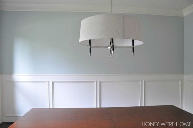
Thank you so very much for weighing in on my paint-color dilemma in the dining room! I read all the comments and really appreciate the feedback. It reminds me why I started blogging in the first place- to have other women who love home decor to bounce ideas off of. My husband is not only color-blind, but pretty nonchalant when it comes to the decor choices in our house (unless he hates something), so I like that I have Y’ALL to share these things with! :)After putting eight samples on the wall, the color I chose was Comfort Grey by Sherwin Williams in semi-gloss, lightened 75%. It was the color that worked best with our milky trim color (Divine White Sherwin Williams) and had the touch more green/not too blue I was originally looking for. I wanted it just a tad lighter than the original Comfort Grey swatch on the wall, so the color specialist explained that they needed to lighten it by 75% because the color spectrum is on a sliding scale and lightening it by 25% (which is what I initially thought I needed) would make it really white. I’m not quite sure I understand this and if you can explain it better, please leave a comment! We painted directly on top of our existing SW Accessible Beige and on top of the different swatches, but I bought a high-quality paint, so it covered really well.
I’m thrilled with how it turned out and think it flows nicely with the paint in the rest of the house. Of course, it’s hard to convey a true paint color over the internet, but here are the best shots I was able to capture from the early morning. It feels so fresh in here now!


I especially like the view from the kitchen, through the wet bar, to the dining room. I almost hate to hang the drapes back up because it will cover that part of the wall.

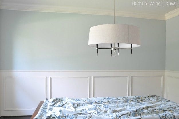
I had to hem the curtains (the bottoms were coming apart) and have yet to get the rest of the room put back together- I’m contemplating changing out the mirror too. And I want to add some summer decor. Hopefully, I’ll have more to share with you next week!
___________
Update: Go here to see the decor updates to our dining room.
__________________


What a refreshing palette. The walls are lovely.
Refreshing is a great word- that's how it feels!
Love the color! Our walls are mostly all in the same color family and I have been itching to change up at least one room.
I was hesitant to change it up, but I'm glad I did. And it's still a "light" color so I don't think it breaks up the pallet too much.
Love the color! We have Mountain Air in our kitchen, dining room, and living room and it rotates between a gray, blue, and green depending on what light source is on.
http://jax-and-jewels.blogspot.com
That sounds really pretty Heidi.
They were lightening it to 75% of the strength of the original color (thus only making it 25% lighter than it was originally)
That makes sense- thank you CeCe!
May I ask how do they lighten the color? Add some white paint? or there are other methods? Thank you!
Hi Jolie! That’s a great question and I’m not sure the answer!
They simply put less pigment into your base color, which gives you a less-saturated (lighter) color. But doing so can also bring out undertones that weren’t obvious in the original color, so make sure you test a sample first!
We used the same color in the water closet of our master bathroom! 🙂
I bet that's pretty!
Ohhh I like it a lot. So fresh and crisp. It's going to go so well with your drapes too!
Finally got those back up! It does look good!
The choice of light colors it's amazing! It really goes well with everything 😉
http://zepedrorodrigues.blogspot.pt/
Thanks Jose!
Beautiful, such a bright and happy look!
This looks gorgeous – so fresh and clean! I am about to paint my dining room, and I have had the hardest time choosing a color. My kitchen color is similar to this but darker. I love the idea of using that shade but lightening it. I have no idea why that has not occurred to me before reading this post. Ha! Thanks!
I hope it works out for you! I don't think I've ever lightened a color, but it turned out well!
Love the color! So fresh and clean looking! What about big plantation shutters in white for your window? So classic and classy! Can't wait to see the finished room! Xo Kathy@The Daily Nest
I got the drapes back up and now I think I need a bigger, round mirror. On the hunt now. Thanks for the suggestion Kathy!
Love the color! Our walls are all the same, drab color, but we're slowly working on painting.
Beautiful, this is going to be such a lovely room.
Thanks Marty!
That so pretty 🙂
I love the color! Such a fresh look!
-Shelley
Ooooh gorgeous! And very elegant.
So pretty Megan! Love your arched doorway and wainscoting too!!
Thanks Becky! So glad we added that wainscoting- it wasn't originally in the plans.
Love that color! Going in my collection for my future home colors!
I don't think you can go wrong with it!
Looks great, Megan! Love the color…we're painting our master bedroom and I was thinking Sea Salt or Silver plate…but may go comfort gray now! Side note: I'm hosting a Freshly Picked giveaway starting July 30 and thought you might be interested in a pair of moccs for James:)
Kaitlyn @ The Birds Nest
http://nestdecorator.blogspot.com
Looks great!
How pretty! I love the color you picked!! XO
Beautiful color. Even though you love that view from the kitchen, I can't wait to see the drapes against the new color – will be so pretty!
Got them back up, show you soon! 🙂
So pretty! Love the new color!
Thanks Carmel!
Love the wall color! How does this lightened comfort gray compare to sea salt?
Thank you!
Hi Tami! Check out this post that shows all the samples on the wall so you can see! https://www.honeywerehome.com/2014/07/choosing-paint-for-dining-room-sherwin.html
Love that color!! May I ask how do they lighten it? What’s the other 25% in it? I would love to have it on my walls! Thanks!!