
Mirrors, Vases, and Sticks OH MY!
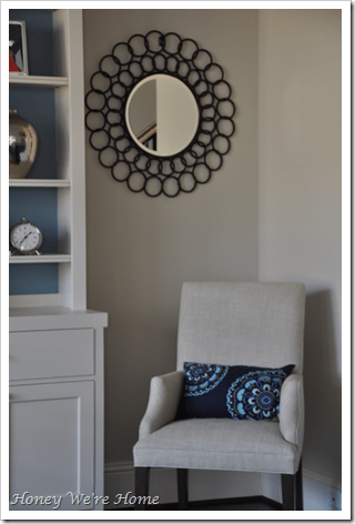
Can I just say you guys ROCK?! I posted about my mirror steal and dilemma regarding their placement and was so happy that you took the time to leave your responses and suggestions. I think I found a nice solution:  I asked, “What would you do?”: The answers, ranked in terms of popular vote (and a tie between 1st and 2nd) were: 1) Mirrors + Vases + Sticks. With approximately 26 votes, those commenters liked the layered look, but a few suggested moving the mirrors up a little, or shortening the sticks.
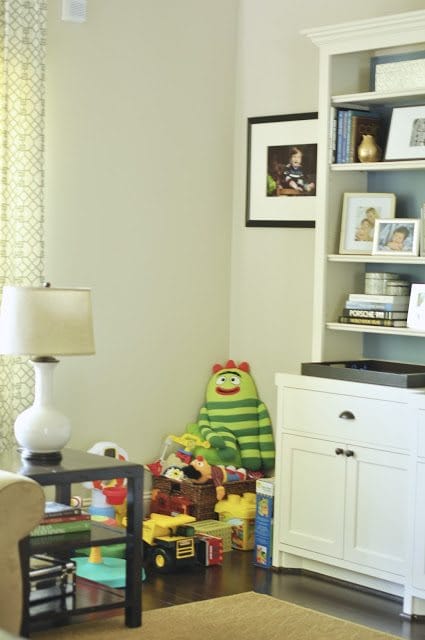
  2) Mirrors + Vases – Sticks. Around 26 people wanted to see what it would look like if I kept the mirrors and vases, but removed the sticks. I brought back one vase for this experiment but I think you get the idea. p.s. this is what our living room floor looks like on a typical day:)
  3) Sticks + Vases – Mirror? About 22 people were in favor of this, believing that adding the mirrors made the space look too busy.
  4) Mirrors – Vases – Sticks + a chair/bench/ottoman/plant. About 21 of you recommended this. I don’t currently have anything that would fit the bill in this category permanently, but to get somewhat of a visual, I played around with what I had in the house (a plant and dining room chair).
  I think the plant is too large (especially in person) perhaps a smaller one would work better, but I like the look of a chair in the right corner, maybe with a small round side table or ottoman. Also, soon there will be drapes on the left side, so that will help anchor the room. 5) Mirrors – Vases – Sticks. About 12 people liked this option. The thinking was it looked more clean and simple this way and the round mirrors complimented the straight lines in the room.
  So, I think for now, I’m going with Mirrors + Chair – Vases – Sticks! 🙂
  I really appreciate your feedback! And it’s nice to show you what our normal toy-filled living room looks like during the day. I’ve been getting some emails asking how I deal with the kids’ toys, so I plan to show you my solutions soon.


This looks great AND adds that extra seating.
Love the chair there! But where did the vases and sticks go? Are you making a special delivery to my house? And I am talking about toys tomorrow too!
Love it 🙂
I think is looks great! The chair is a nice addition.
I like what you did. The chair is perfect for extra seating. The plant made the corner a bit busy behind the lamp. Once you get window treatments I think it will be the perfect balance!
Great choice. I like the mirrors and extra chair. They tie the room together.
Love the chair, it will be perfect for your little man to climb on to try to get to the mirror!
Bottom line is I think it all looks great! What you like today will surely change again later. I'm constantly moving things around!!!
I'm pretty sure that's my favorite option of all of them. The chair adds a nice bit of depth without making things too crazy busy! If I didn't get a chance to say it on the earlier post, I love those mirrors!
Looks awesome 🙂
Awesome solution! The Chair adds some weight without being too heavy if that makes sense. Love all the toys, that's the story of my life! My home is only pristine while my 3 monkeys are sleeping, lol!
It looks so great – I love how the black mirrors tie in with the TV and makes the blue and silver really pop!! I'd love to see a "day in the life of honey we're home" post, with tips how you balance home/work life, being a mom and managing to find time to work out – you seem to do it all so well and you are so inspiring! 🙂
Love it! I agree, extra seating is always a plus.
Good call. I love the mirrors there and the chair is great. Adds nice extra seating. This blog world is great isn't it!
I love pic #2- because I see baby James attacking your vase.
How can a space be both kid-friendly and chic?
Today, I caught Moose STANDING on my granite.
Moments later, Monkey trying to remove a painting from the wall.
Anyway…I recall seeing a crafter how made a circular display like this out of cardboard rolls…her name escapes me, but I will email you if I remember!
I think the addition of the chair wins!
I love your solution! Can't wait to see some posts about kids' clutter. 🙂
I think that option looks great!
That looks great. I like those blue pillows you have on the couch and on the chair.
I think that is the best choice! I really like that look. Your room is looking fantastic!
Yay for the chair mirror combo! Looks great!! 🙂
Love it Megan! Good call. Agree, a smaller plant would be better but I kinda like one side with just the mirro since you have the lamp so close by and will be adding drapes!
I agree with many others: the chair wins. :o)
And that first photo where you "confessed" that was how your living room usually looked is right in line with mine . . . right down to the child that is completely ignoring his/her toys and playing with the home decor!
It looks great! Good choice!
I love it the way you have it now! The mirrors are so gorgeous and the chair fills up that space perfectly without looking overwhelming or cluttered. Beautiful! 🙂
Megan, the chair looks fabulous!! It is the perfect touch for that space!! Hugs-Val
Love your final choice the best – it gives dimension and functionality without hiding your fun, frugal finds! 🙂
Great job! The chair is a good fit. Thanks for including us in this little exercise–it was fun!
I love your solution! I think it looks great! Personally, I am fine with a little empty space, so I don't think you even need to find something for the other side of the cabinet. Well done sweetie!
xo
I love the chair with the mirrors. I think you made the best choice.
I like the direction you decided to go in!! It does look sleeker. And your toy floor very much resembles every square inch of my first floor right now!
I just love the fact that you went to all the trouble and tried everyone's suggestion, took pictures and posted! Good luck deciding.
Look great. Gives the room a cleaner feel and now you have an extra seat for guests:) Love the picture with James touching the vase, if he is like Sterling he must be into everything!
love the chair there! it's so perfect and quant and fits the room to a t! great idea!
Woohoo! My vote won! I must say, it does look nice with that chair there;-)
Definitely loving that option! It looks great, Megan! 🙂
Great choice!! I forgot how I voted already, but I'll claim the choice you went with, just for bragging rights 😉
I really love it now! That chair is really cute, and is the perfect scale. Again loving those mirrors!
this looks great megan! im wondering now where you put the vase and sticks? just nosy….
looks good – I am so visual that I really have to see it and while I I voted the 2nd option, I agree the one you picked looks best now that I can see them all! 🙂 Great job
Hi Megan….fyi I live in St. Louis and the Home Goods Store here has a white "leather" chair with silver nail head trim that would be fabulous in your office…..check your store and see if they have it! 🙂
Suzie
The chair looks great! x
I'm so glad to see a pick of that option, that was definitely my pick! Those mirrors are just too awesome to leave out! And really, where else would you be able to put them together? And then they would be sad. We can't have sad mirrors. (c: Looks awesome!
It looks fab. I have a similar TV entertainment center that I'm always struggling with what to put in and around it. I love the look of yours, and I love that photo of James! It looks like he's helping you move the vase back into place. Mommy's little helper!
Love the look of the chair in the corner!
x
LOVE the chair there. A small metallic round table next to it would be great.
Megan,
Your home is stunning! What ever you choose will be beautiful.
Cheers!
Shelly
p.s. I'm having a little giveaway and would love for you to pop on over for a chance to win!
Perfection!
Love it with the chair and sans vases/sticks. It was definitely too cluttered before. It looks beautiful (as usual!). 🙂
Perfect!! I love the chair there. I am a very symmetrical person so I would have another chair on the other side maybe ?
Your home is amazing!!!!!!!!!!!!! I like the setup you chose although I do think that whatever you decide would be great.
http://www.chandrassouthernlife.blogspot.com
I just saw your home at Made by Girl and HAD to come and say hi & see your blog! Wow those mirrors are beautiful!! I like your choice with the chair. The sticks & vase was definitely flooding the space! Beautiful room tho!
I just bought my first home so I'm always looking for new inspiration! I have to follow your blog!! =) Hi!
Melanie's Randomness
Megan,
I just saw your home on Made By Girl. It is amazing! Your kitchen is flawless!
I love the last picture the best – Good choice!
Hi nice to meet you, you have such a fresh clean style – love it. I like the third choice, great you have a comfy place for all those toys, wonderful. Have a great weekend!
Good choice! I'm sure you'll find just the right fit when you spot it.
SUCH a fun experiment! I'm actually loving the first one with the mirrors+sticks+vases. The mirrors are a definite MUST! They are gorgeous!
Btw-I found a circular mosaic mirror for our master suite and it made me think of your diy starburst mirror project – i didn't make it, but it is gorge!
ps-i posted a giveaway, would love for you to enter!
http://www.meg-land.blogspot.com
xx
Hmmm…interesting dilemma. I think what's throwing it off for me are a few things. First, I'd don't think the blue on the back of the cabinet is working at all. The brown vases, sticks and other brown and tan elements work nice in the room. I believe that rooms speak to us and I just don't think that blue is the right color. Change the back color of the cabinet and also work on the display items in the cabinet-it looks too busy with too many shelves and knick knacks. It looked cleaner and more streamlined in the earlier photos when the cabinet was newer.
What I'd like to try is to remove some shelves and accessories and put the mirrors inside the cabinet as a backdrop for some display items. Essentially, you'd paint the back of the cabinet the same color as the walls, then remove most of the shelves on the end pieces of the cabinet, keeping the bottom shelves and then centering the mirrors above it. Essentially, you'd be taking the mirrors at the height they appear in the photo where you have them behind the vases/sticks and moving them inside the end cabinet pieces. That way, your vases and sticks look great and your mirrors add a pretty graphic inside the cabinet. Next, dump the blue pillows and replace them with a brighter color, maybe a modern graphic and then pick up that same color in some accessories that you display in the cabinet. I'd also like to see some books lying flat on the shelves with some picture frames sitting on them for some added height and visual interest. Move the chair to the opposite end of the wall (assuming it's on the NE end, move it to the SE end of the room with the feet of the chair on the rug). You are so close to being there! I do think it can be harder when it's our own space. I love the brown vases and sticks and the graphic elements of the mirror. Finally, if I could make one other suggestion, try a round leather brown ottoman in the room to carry the brown over into the room. Crate and Barrel had one that I recommended for a client of mine a few yars back. They had a little one and I thought it would be perfect for the kids to crawl up on and not get hurt, yet it looked amazing. Hope this helps.
Here is a photo of a round leather ottoman which repeats the circle theme from the mirrors.
http://www.thefurniture.com/store/proddetail.asp?prod=ASHL-SD-POWELL-OTTOMAN-526
I just checked C & B site and they no longer have the brown, round, leather ottoman. Of course, once I did all of this, I looked at your photos again and saw you already have a rectangular ottoman that wasn't real visible, lol. I still think the round one would be better to repeat the circles element but I doubt many of us could afford to replace that.
As Coco Chanel said, always remove one thing before you walk out the door. You've done the interiors version of this! I'm definitely a fan of a streamlined aesthetic. Love the tailor-made storage/cabinet.
Looks fantastic darling! I think you made the right choice!!
I love what you did! I was one of those thinking that the mirrors+sticks were too much – so I really like this version (and I love that chair!)
Well done!
I think you are getting there for sure. I like the chair on the right and I am thinking you shoule try to put one vase in the left corner. Give it a go!
I actually really like the color & texture? of that chair in the corner. It is pretty with your wall color and white of your media cabinet. 🙂 XXXX
I like the vases+sticks but no mirrors. But I also like the chair concept…a little less uniform.
Where is the chair from?