
Our Spring Mantle (Two Ways)
Hi all! If you’ve been reading along for awhile, you know we don’t have a fireplace or a mantle in our house, but the console table in our entryway has functioned as a little display area over the years. Right now, we’re showcasing some lime green in honor of Spring! I’ve styled our table two ways, I’m curious if you prefer one over the other.

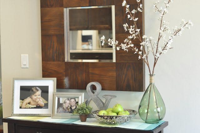
Our first vignette features family photos and things in our home which have a way of playing musical decor (like the Target runner and jar from Home Goods, which were previously on our breakfast table).

I’ve got some faux blossoming branches in the jar next to my favorite, inexpensive green apples ($1 each) from WalMart. We typically have fresh fruit on hand in the kitchen which always adds a nice splash of color to the room, but here in the entry, I like the pop of color the faux apples add.

My favorite recent find is the ampersand I got at Target. It’s hollow and adds a cute bit of character. I’m sure at a later date it will look great in one of our bookcases or in my office.


Then, because I’m actually not crazy about all the dark wood (mirror and console), because I think it looks and feels too heavy, I traded out the framed photos for a propped up Made By Girl “LOVE” print, which obscures the chunky wood mirror some.
I like the simplicity of the second table, but the family photos are a nice personal touch to come home to. What do you think?
The area is constantly in flux, so there’s no right or wrong answer:)

You might remember last Spring, we had a simple arrangement of huge sunflowers in our entryway.

And last summer, our mantel was full of sand and shells.

Our Nativity Scene stayed here at Christmas.

Our you styling your mantle for Spring?


Like both, but I think I prefer the 2nd. I think in the first too many things are competing to be seen.
I love the LOVE print so I would have to say the second one but all of them are great!
I like the second look, simple but nice!
I like them both as well. But I think the 2nd one wins for me because it's simpler.
What section did you find the ampersand in? I need one!
I like the first one because I love family pictures.
They both look nice, but I like the first arrangement. (Maybe I'm partial to the collection of family photos.)
Love your looks Megan – I think the "love" version is my favorite!
I luv the Love picture! So, I vote for the 2nd picture. BTW the apples look amazing in the bowl–it took me a few moments to realize they were faux!
I like the second. LOVE the LOVE print. And I like to use green apples, too. Your photo is beautiful, girl. So pretty.
I LOVE the ampersand! Super cute…and Target you say? I need it! Great vignettes! 🙂
sooo pretty!!
XoXo
Elizabeth
http://theelegantlifeofe.blogspot.com/
I think I prefer the one with Love sign! But the other ones are great too!
http://curlijuli.blogspot.com/
Hi, this is my first time posting, but my vote is for the first one. It just seems more proportionately appealing to me! 🙂
I must be in the minority, but I much prefer the first one. I actually have our entryway styled with a turquoise vase & flowers that are both very similar to yours! Clearly, you have great taste! 😉
Both are beautifully done, but I prefer the first table. I love the personal photographs!
Im the minority. i like the first way better. The steel LOVE frame seems to be clashing against the wood.
The shells and the sand are my absolute favorite !
I love simplicity but I am partial to the first one.
I love the ampersand. I saw it at my Target too (in more of a dark brown wood) and I admired it, but just couldn't think of a place to put it. Love it!
Love the Ampersand…saw it at Target and probably should have grabbed it… hmm, maybe I'll get it at one of my other 4 trips this week haha.
I think I like the first one! Ampersands are so cute. Great touch!!
I like the first one; it seems so much more personal. 🙂
It looks great Megan! Love the greenery with the apples. Hope your doing well- we need to meet up soon!