
DIY (LOVE) Art
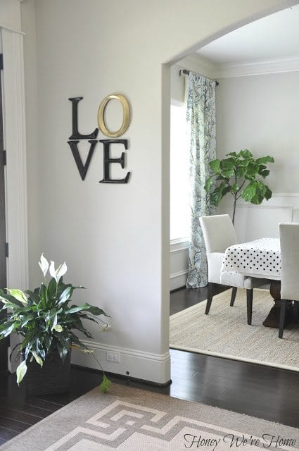
What is the message I want to convey in my home? Love. Lucky for me, I have a prime spot to display a little whimsical LOVE art.
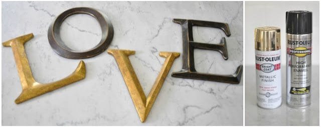
I’m a big fan of typography, letters, words, and think they make great decoration in the home. You’ve probably seen these 12-inch letters at Hobby Lobby. They sell for $10, but are always on sale for 50% off. They come in a rustic gold and bronze, but I wanted them in a glitzy gold and black. You can also get them online here![]() for $6.99.
for $6.99.
These are my two favorite Gold and Black spray paints. The gold is a true gold (I have another that is more rose gold) and the black is super shiny. I didn’t prime these letters- just sprayed the paint right on.
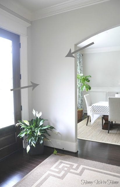
I arranged the letters in a box shape to balance the wall. And I thought this arrangement looked more modern.
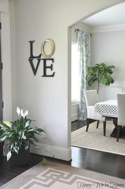
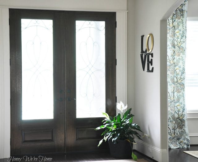

I really like it, but is it me or is the “E” bigger than the “V”?? I’m terrible at hanging things on the wall, so I might have to try again.
P.S. A couple people asked about the rug in our entryway, it’s from Home Decorators, here’s the link. Sorta wishing I got the darker brown now . . .
* * * * *


Love it! The gold "O" reminds me of a wedding ring
Love that you did just the O in gold. Looks great! The E does look a smidge bigger but I wouldn't have noticed it if you hadn't pointed it out!
Pinning this! Love it (no pun intended)! The E looks a little bigger than the V, but I think it looks balanced with the L.
So cool! "Love" how you have it arranged! I am currently trying to find 18" letters to spell out "HOME" and only have found O and E….thanks for the inspiration! ~Kim
I just found this website on Pinterest (all good things are found on Pinterest these days 😉 ) for letters!
http://www.craftcuts.com/wood-letters/unpainted-wooden-letters.html
Totally addicted to Pinterest too!
I love the way it turned out! Looks great! I am also quite smitten with that rug in your entry way…can you share where you found it?
Hi Mandy, that rug is an indoor/outdoor rug from Home Decorators.com.
Very cute idea! I really like this!
Very neat idea…I "LOVE" it!
I love this! I think the E does look bigger, but just because the V is so narrow at the bottom. I think it looks great now but if you're worried just lower the V a smidge, it will look more framed inside the E.
Great idea! Looks great arranged on top of each other. I think the slightly larger E only adds to it's style! 🙂
What a classy and simple look. I agree with Jamie, I think the L and E balance it out. I wouldn't change it. "LOVE" this look, I'm pinning it! 🙂
hehe. I also think the E is bigger than the V, but it could also be a visual thing, because the E takes up more visual space AND has a gold O above it. Maybe more of an optical illusion?
Still looks wonderful!!
What a simple and classy look. I agree with Jamie, the L balances out the E, I wouldn't change it. "LOVE" the look… I'm pinning it! 🙂
I bought those letters for my son's room and I swear they are different sizes too! Love the look and love your blog! Thanks for posting.
I love your idea of painting the "O" a different color. AND how you arranged it differently, that is what makes is so cool! You could do this with lots of words, both the painting one letter a different color and hanging them in a non-traditional way. I am so going to try this is my house, with some word, somewhere!!! Thanks for the great idea!!!
Very cute – crazy how great something so simple can look with the right layout and spray paint!
And do you mind sharing the paint color on your walls shown in the photo? I love it and am looking for something similar for our bedroom. 🙂
Thanks!
Darci
This looks great! I've been looking for more crafy ideas for my walls, so this might just be a project!
What a great idea! I love your wall color as well 🙂 thanks for sharing!
Nice work! I LOVE it! 🙂 You have a beautiful home!
good job:)
looks super cute!
http://coffeebeansandbobbypins.blogspot.com//
Great job!!! I love the O in gold! I really enjoy your posts, they inspire me to make my house look pretty too! -Kristen
http://chiclittlebits.blogspot.com/
I'm curious about your curtains. Looks like love to me!
I love the way you choose to hang the letters. Also, can you please tell me where you got your area rug?
Cheers!
Here ya go! http://www.homedecorators.com/P/Martha_Stewart_Living_Deco_Frame_All-Weather_Rug/800/
LOVE your blog name!! 🙂
lovely 😉
Great idea – I never thought to do a DIY of Robert Indiana's LOVE sculpture…and I'm from Philadelphia, PA! Keep up the great ideas.
OMG…cannot believe our paths just crossed after 15+ years….awesome blog (wouldn't expect anything less!!) Life seems to be crazy good…so happy for you! LOVE your home…it's BEAUTIFUL!
Think it looks great! Didn't even notice the E is a bigger till you mentioned it, so I wouldn't worry about it.
Love it. The gold O just makes the whole thing. Hugs, marty
I like how it turned out I love you entrance doors.
"LOVE" it!!
I think it looks great. Yes, the "E" is larger however I am not sure if you can do anything about it. The tops of the "V" and "E" are lined up and if you move it, it may not look as good. I think you are fine. It really looks nice.
"LOVE" these. Such a cute idea. . . maybe the v can go a tad lower to fool the eye if it's bugging you. Just darling.
I love those letters from Hobby Lobby! And the way you have hung them is perfect — looks beautiful! 🙂
Where did you order the letters? Too cute and chic!
I really like this! You are so crafty and creative!!
I love how you arranged the letters and the gold O. I wouldn't worry about the E unless it's really bugging you. Love the Pottery Barn table setting, too!
Adorable! LO
VE it! 🙂
Question on your entry way rug – is it really thin? I am looking for new runners in my kitchen…. I love to cook and I am standing for quite a while sometimes….so, I really wanted something with a little more padding/cush….I love your rugs in your kitchen also (the older ones and the newer ones) but they look a tad thin too – (any suggestions??)
Love your home….and your Blog! Thanks for sharing so many fun, great things!
🙂 Yes, the rug is thin. But, you can add a thick rug pad- I've gotten them before from Overstock and if you get a thick one, it will add that cushion you're looking for.
This is totally random, but did you see where pottery barn now has the extra long clarissa glass drop chandelier??? It is beautiful, and I remembered you liking it awhile back, but thinking it was too small. I was in the exact same boat with loving the look, but it was way too small.
Kara
No, I didn't know that! Thanks so much for filling me in. I still have my old chandy and still want to change it. I found a Jonathon Adler one I love, but not the price so much:( I'd like to see the PB one in person, I wonder if they have it at the store- may have to pop in and see . . .
I love this Megan! It looks fantastic! Also fun to see the peek of that fun black and white polka dot fabric on your dining room table. Happy weekend to you.
I totally love this…and TOTALLY have a good spot to do it myself! (don't mind, do you?!). Also, is that a new fiddle leaf fig or did you move it? We have 2 that we are trying to keep alive 🙂 They are so pretty.
What a lovely and simple idea!! Thank you for sharing.
I don't see a difference at all. It looks great!
Looove it. I always forget that you can just spray paint things to be the color you want. I seriously won't buy things because they're not the right color…need to keep this in mind from now on.
Right! I just spray painted some lamps (for the second time- first time blue, second time black) and I love painting things GOLD right now.
Great idea, Megan! I would just lower the "V" just a smidge if it's annoying you.
I absolutely lOve this!! so cute in a square shape!
Please don't move the E. Not only does it look "fine" it looks BETTER being larger. I'm a photographer and I stare at graphic design/logos a lot…trust me on this!
Looks perfect Megan. Love the arrangement!
Beautiful!! Can you tell me what size rug you went with? I'm building a house and the foyer looks about the same size 🙂 Thanks! Amanda
Love this idea! The "E" does look bigger, but I think it's because the "V" doesn't have the bottom part because of it's shape. Looks great though. Totally want to "borrow" this idea! 😉
I want to know about that Fiddle Leaf Fig! What is your watering schedule like? I just got mine and I'm trying to keep it alive 🙂
Love this..pinned it and revisiing. I just noticed you have double doors. While I love mine, I find it challenging to decorate. ..front mats? 2 wteaths? Would love a post on how you handle it. Thanks for all you do!!
Love your house!!! Absolutely beautiful. Any chance you could tell me what color you painted your walls.
Hey there! We have just built a new house and it’s time to pick interior paint colors (like by later today ?). Just really hoping you might share what color your walls are painted as I’ve been though dozens of gray paint samples and I’m still struggling. It would help me out soooo much as I think your paint color looks fantastic!!
Oh that’s exciting Gidget! I’ll pass along the link to the post with ALL the paint colors in our house! Hope it helps!
https://www.honeywerehome.com/2016/08/paint-colors-in-our-home-2016.html
Hi! I love the color of the gray wall. What brand and color is it?
Hi Yaz! Here’s a post with all the paint colors in our home! https://www.honeywerehome.com/2016/08/paint-colors-in-our-home-2016.html
Love is pure, not to be picked apart but that’s what ppl do, they pick the parts they want… keep loving, love comes in all different shape and sizes and yet is perfect..
I love your LOVE! Peeking into your dining room, I also love the drapes! Could you share where you found them? Thanks!
Hi Linda! I bought the fabric (Dwell Studio) and made them! 🙂
What color/brand are your light gray walls?
Tnx