
Paint Colors in Our Home
I’m often asked about the paint colors used in my home and wanted to compile a list so you (and I!) have them all in one place. All of the paint is by Sherwin Williams- it’s what our builder used and I’ve been happy with it, so I stick with it. Of course, it’s difficult to get a true reading of a paint color over the internet. Sometimes I edit my photos to make them brighter which may distort the color, but I’ve tried to pick the photos that depict the way the color looks to my natural eye during the day. Also, the color changes depending on the light in the room. If you have any questions, leave me a comment and I’ll reply to it. I hope this is helpful!


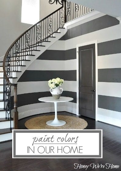
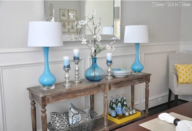
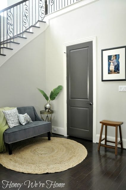
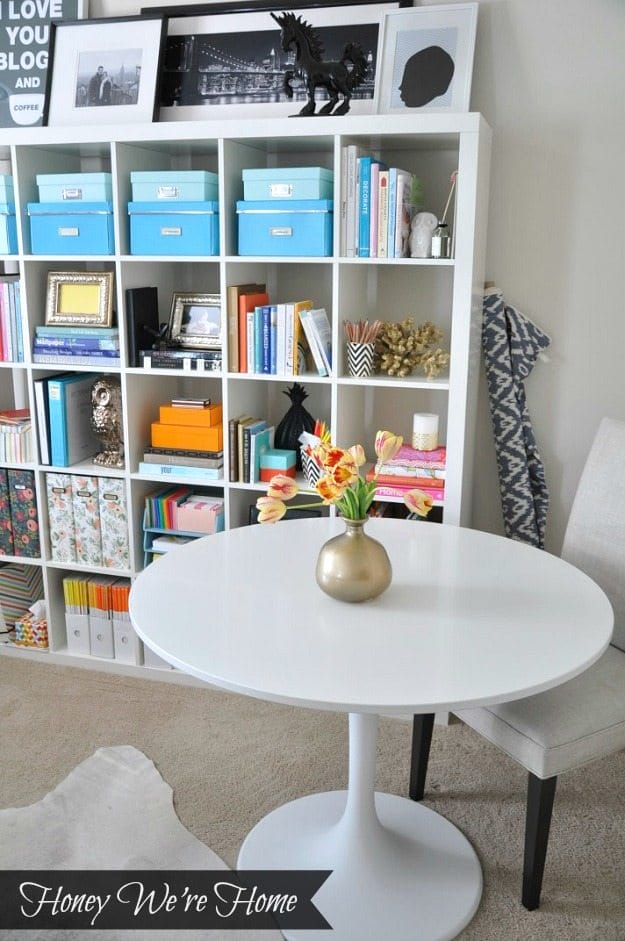
All Downstairs Walls – Accessible Beige
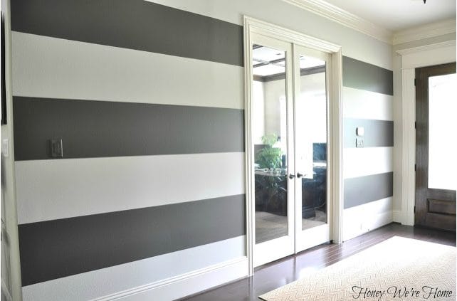
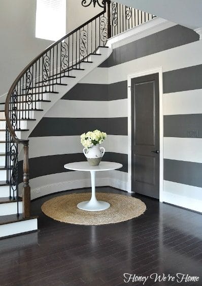
I previously reported it was Agreeable Gray because that’s what I thought- but after buying Agreeable Grey for touch-ups around the house, I realized I was wrong. 🙁 I had go into the attic to see what old paint we had and finally figured out it is, in fact, Accessible Beige. Agreeable Gray is cooler, but not too terribly different. I repainted the entire entryway wall (the one with the stripes now) Agreeable Grey and it blends very seamlessly with the adjacent wall that is Accessible Beige. I hope this makes sense!
The best way I can describe Accessible Beige is as a creamy greige.
full post HERE
All of the walls downstairs are Accessible Beige- except the entryway stripes, so you can refer to other photos below to see how it looks in other rooms. It’s also in the upstairs hallway.
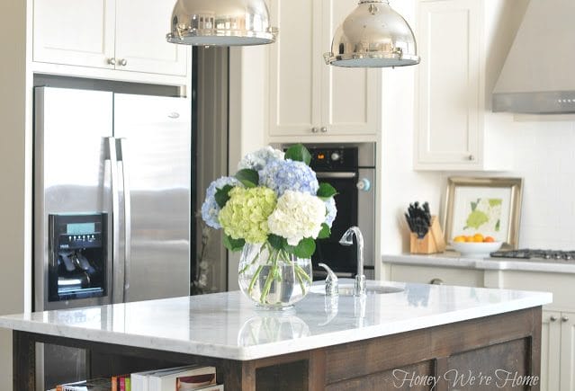
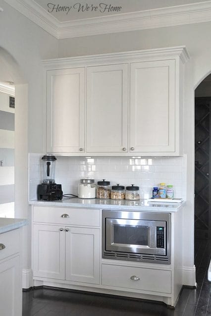
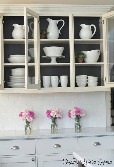
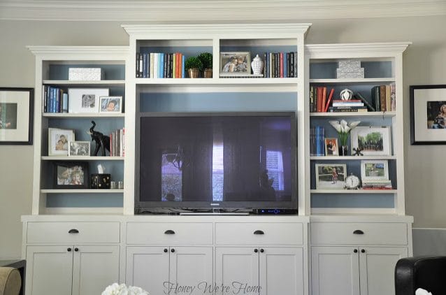
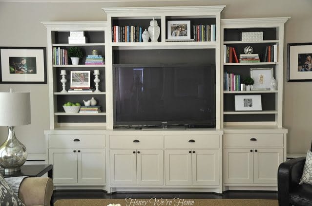
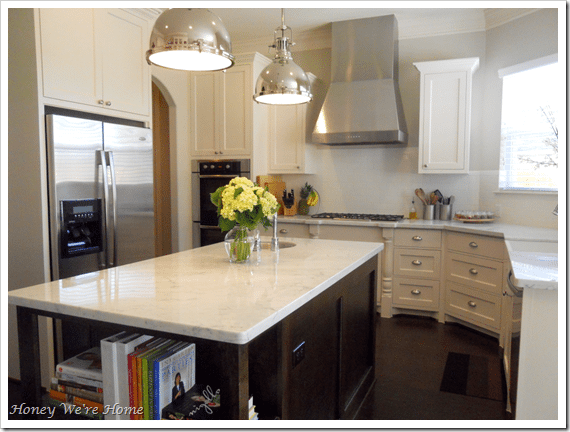
All Trim, Ceilings, and Cabinets – Divine White (flat)
full post HERE
full post HERE
Inside Kitchen Cabinets – Urbane Bronze

Stripes – Urbane Bronze
This is the wall I accidentally painted Agreeable Gray.
This is the wall I accidentally painted Agreeable Gray.
full post HERE
These two walls are Accessible Beige and Urbane Bronze.
full post HERE
Downstairs Bath Door- Black Fox (Semi Gloss)
full post HERE
Inside Media Cabinet (first)- Jamestown Blue
Inside Media Cabinet (now) – (Urbane Bronze)
full post HERE
Hallway Doors – Black Fox (semi-gloss)

full post HERE
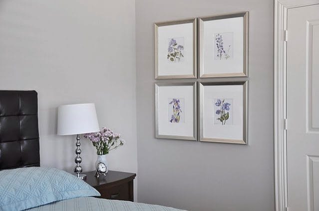
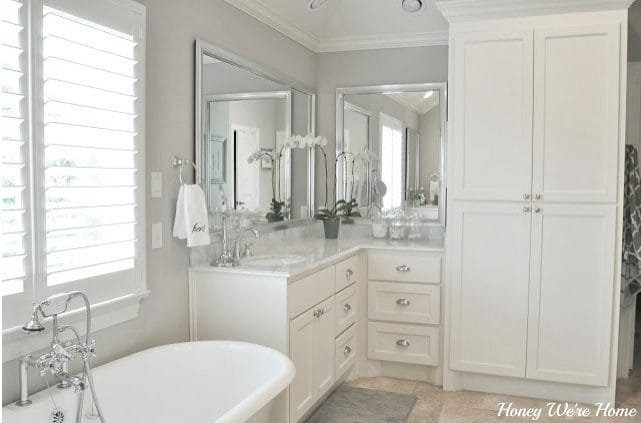
Master Bedroom, Sitting Room, & Bath – A New Gray
full post HERE

full post HERE
full post HERE
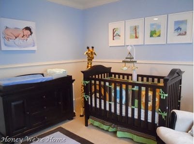
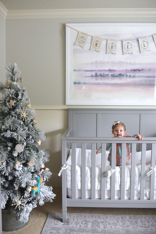
Son’s Nursery – Blissful Blue
The color is similar to what’s on his ceiling now.
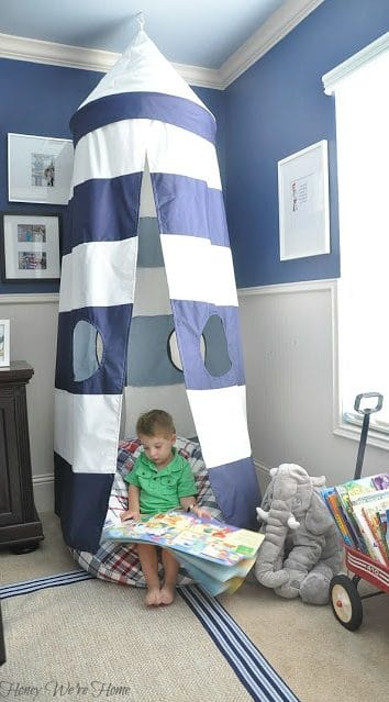
Son’s Bedroom Walls –“Indi-go-go” by Benjamin Moore – color matched at Sherwin Williams)
full post HERE
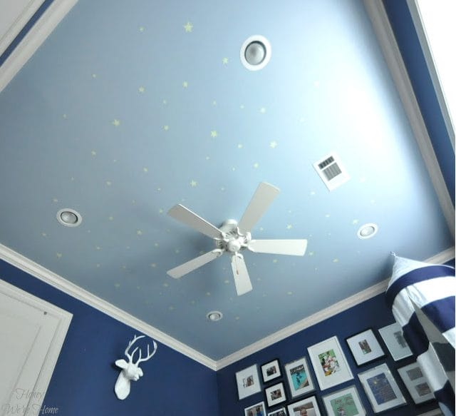
Son’s Bedroom Ceiling – Honest Blue
full post HERE
Home Office (Now) – Divine White
Which is the same as our ceilings, cabinets, and trim. It’s a soft white.
full post HERE
full post HERE
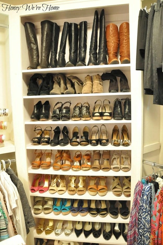
Closet Island, Shoe Shelves, & Dresser – Venus Pink High Gloss
This pink is very pale/sheer.
full post HERE
full post HERE

full post HERE
If you have any questions, let me know!

__________________


I love the blue flower vases, such a pretty pop of color! The paint color you chose for the back of your kitchen cabinets is perfect for that space!
E+J
Im loving the Urbane Bronze! It looks to be the perfect shade of dark gray! Just what I need for my nursery
craftingafairytale.blogspot.com
Love it all girl! You have such a great eye for choosing color! Thanks for sharing your colors! Happy Valentine's Day friend! xo
beautiful!
oh my goodness, the grey on the inside of your kitchen cabinets make your white dishes pop! I love that idea!
Gorgeous, M! And I love that I know all these spaces personally, too!! xo Happy <3 Day!!
I love that most of your downstairs is the same color, but you have it dressed up and it's not boring! I've been trying to think of a way to work with our open floor plan and paint colors, but I was afraid to use the same color over and over again. Now I see it could totally work!
Your house is gorgeous. Nicely decorated, not to stuffy that is doesn't feel like a home. That's not always easy to do, but you did a great job. Connie
Love your house! especially the closet and the kitchen.
I have a non-house related question for you – i'm thinking of getting the Michael Kors Salma as a work bag – I see that you've listed that as you favorite bag, how are you liking it as a work bag so far? how's the capacity and is it heavy? Thanks!
love the striped entry hall and your blog!
Love the creamy greige … and your home (so beautiful!)
xx Lexi, Glitter, Inc.
OMG this is beautiful all the way around. I'm in awe!!!
Such a beautiful home! I love decorating! I'm excited to do a work over after I pull of our big Spring deep cleaning.
i went to Sherwin Williams today looking for paint for our bathroom. I picked up the sample Accessible Beige (not knowing that was one of your colors) Is that the color in your kitchen also? It just looks lighter in your kitchen.
What is the main color in your kitchen? Accessible Beige or Agreeable Gray?
Accessible Beige
Aren't those stripes great? Your home is so beautiful. Wow Megan, I am so envious. I think it's time for me to re-do my home especially my room. Thanks for the inspiration!
Thank you Valerie!
Hi Megan, I just bought sample pints of accessible beige, divine white, agreeable gray and black fox. The in-store chip of divine white looked so beige and I'm surprised that you used flat paint on the trim and cabinets – how does it clean up? I'm ready to paint my LR, my kitchen/dining/hallway and maybe paint an accent wall with black fox behind my TV so it doesn't look as prominent. I paid for two gallons untinted paint in semi-gloss and two gallons of satin because I've had problems with cleaning marks off of walls in the past. Now I'm having second thoughts on which sheen to use. Your cabinets and trim look so much lighter/whiter than the store chip though I can definitely see using it on ceilings. Time will tell, when I try out the pint samples. I love that white is back in style, and gray, but I want a lighter gray. My bedroom has been a shade of gray for many years. The current paint is named True Taupe but it matches my silvery gray carpeting pretty closely. I love your house! I've wanted a white built-ins wall in my narrow LR for a few years, it makes sense in the room and will avoid dead corners. I'm inching closer to being happy with my LR, it's been a long time coming. Thanks for all of your paint information and sharing your home. ~ Mary
The clean-up is okay, I went with our builder's suggestion on those finishes. I'm curious if you've found your perfect paint yet- can be such a hard decision.
Could you tell me the exact colors by Sherwin Williams that you sons walls and ceiling are?
The ceiling is exactly Honest Blue and the color match is as close as I can get you to the walls, but Sherwin Williams will know how to color match other brands colors- that doesn't make the matched color anything that is specifically SW if that makes sense. Great question though!
Hi, for the stripes in Urbane Bronze and the main wall color (Accessible Beige), what finish of paint did you go with? Is it Satin or Flat? Did you use the SW Emerald Line? Thanks!
Hi Megan, do you know if your kitchen cabinet paint is a regular water based paint by SW or if it's a lacquer?
I think it's water based.
Your home is lovely. I love the colors! I found your site while searching agreeable gray and accessible beige. Which of the 2 colors do you prefer?…i currently have accessible beige and love it but ill be moving to a new home with dark kitchen cabinets and was contemplating agreeable gray. Im worried about the accessible beige showing beige undertones next to dark cabinets and the agreeable gray possible showing blue undertones. I figured you look at thosr colors daily and would know…
Thank you Chelsea! The Agreeable Gray is more grey and the Accessible Beige is more beige so it just depends on what you're going for. I don't think the Agreeable Gray looks blue, but try both on a poster board and move them around your kitchen and at different times of the day to see how the color changes. Hope this helps!
Thank you so much for this blog! It is so informative & entertaining.
I am renovating my home & I love your kitchen. Do you know what brand cabinets you have? Also, how are your cabinets holding up?
Thanks!!!!
Thank you so much! Our cabinets were built when we built our home, so they aren't by a particular brand. They've held up well!
Hi Megan,
I love your home! What do you think about Repose Gray by SW or Behr's Billowing Clouds for a living room that is north-facing?
Thank you!
Thank you! I'm not familiar with those colors, but a good tip is to paint the swatches on a poster board and move it around the room to see how it looks at different times of day and in different light.
Do you think that Accessible Beige would work well in a more dimly lit room? I don't if you have any rooms like that. Would it be grayish still?
It's hard to say, I would still recommend painting the swatch on a poster board and moving it around the room to see how it looks in your home.
Is the color in your master "Anew gray" the shade darker than agreeable gray? It looks so pretty on the walls and a bit lighter than it looks on the swatch to me and just wanted to make sure since the name is slightly different. I'm contemplating it also for my master bed and bath! Thanks!
Your home is beautiful! I was dead-set on Agreeable Gray, but once it was up …it really flashed blue…so we started over and repainted with accessible beige. Love the color! Agreeable Gray is quite lovely but with my spiced maple cabinets and gold countertops. (Home built 9 yrs ago)..the accessible beige seemed to be a better match. Definitely looks more beige on the swatch, but difinetly more gray on the wall…it’s beautiful. We have decided to use this color as a whole house color…very light and airy! Glad we made the switch!
Happy painting!
**Tried inserting pic of both but blog would only allow for comments.
Thanks girlie! It’s really the perfect gray color. I’m sure it looks great! 🙂
Hi Megan,
Love the colors and decor. Planning to repaint our doors in darker color and noticed your darker door handles. Do you know the brand and if they are truly blacker or rubbed bronze? Most I have seen in stores are not truly black, or if they are, look too contemporary to me.
Thanks
Hi Birgit, I’m not sure the brand of our door handles, but ours are almost black with a bit of bronzed distressing. Hope that helps!