
Color Confusion
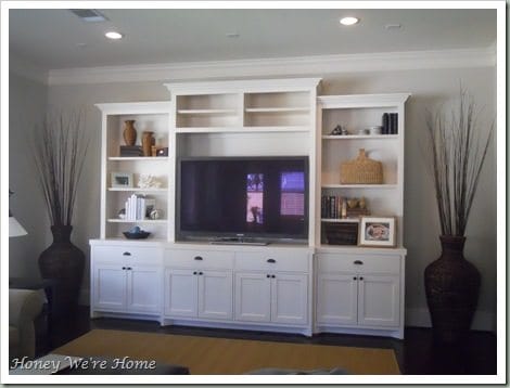
I’m having such a hard time deciding on a paint color for the back of the media cabinet in the living room. My husband is color blind and no help at all. Thank God for blog friends!! Here’s what I’m working with. 
 As you can see, it’s a pretty neutral color palette and I want to inject a little color. I’m planning to remove some of the brown accessories and replace them with silver and white. These aqua decorative balls from Target are my “color inspiration.” I will also be adding colored/patterned?? drapes in the future.
  Here are the colors I found in the Sherwin William’s color deck that I thought might be nice. Our walls are painted the tabbed color, so I was using that for comparison.
  Then I “happened” to be in Pottery Barn, and they sell large sheets ($5- ouch!) that are samples of Benjamin Moore paint colors. If you take the purchased sample to Benjamin Moore, you get $5 off a gallon of paint. I bought the samples of these colors.
  And started playing with how they’d look in my media cabinet. The silver bowl is a new accessory I found at Home Goods.

 So far, I think I like the darker blue on the middle shelf. Is the dark blue on the upper shelf too dark? The pale blue is too pale. Here’s how the Benjamin Moore colors compare to the Sherwin Williams’.
  I’m still considering these, but it’s so hard to decide.
  Any thoughts, suggestions?? *help*!!


Fun post! I really like the middle blue too. The top is probably too dark, and the bottom has a hint of purple/lavender. At least on the monitor it does. It's going to look so good painted!
Diggin' the new blog design!
I agree with your color choice… I was thinking those same things before you even said it!
And those $5 paint samples aren't much different than the $3 ones at Lowe's and you don't have to paint them!
I'm going through a "bigger than expected" home remodel project myself right now and had to get about 20 paint samples for three rooms plus match 3 existing colors so I feel your pain. And it's going to be gorgeous when you finish!
Here's a link to my blog… second entry down shows some colors. 🙂 http://crewzn.blogspot.com
I think you are right on about the blue on the middle shelf! It looks perfect… especially up against the white coral–pretty! 🙂 That pop of color is going to look so great! Can't wait to see…
Yeppers, for sure the 2nd shelf blue. It's going to be fabulous. I have the same project going on, however my wall unit is black. I have no idea where to start. I have my eye on wall paper from Graham & Brown (http://http://www.grahambrown.com/uk/product/17806/Cotswold?show=.com ). Please post when you are done! I can't wait.
Love the 2nd color! Not too light, not too dark and it shows off your accessories perfectly. That is the biggest thing you have to keep in mind. I think the silvers and whites really pop against that blue. I almost bought those blue balls yesterday at Target!
I like the middle blue. Have you thought about using pages from an old book or sheet music? You could even put it on foamboard and change it if you are unhappy-just modpodge and voila! I'm thinking of doing that in my living room.
My vote is for the blue on the bottom left shelf. it's just enought of a punch of color, but it's still subdued enought to not be a distraction. Afterall, you want what's being featured in your cabinet to be accentuated by the color, not overshadowed by it. Just my opinion – good luck choosing!! 🙂
I love your colors, but I think I would look for some wall paper or even some scrapbook paper that you could hot glue in? Then you could change it out any time your color tastes change…. The nester did that with her dining room cabinet and it was gorg. Plus you could implement all your colors along with a little pattern.
Well, I really love the idea of painting the back to bring in some color, but I guess I am alone in thinking the top color, darkest blue, is the way to go. The contrast between the really dark, the bright white & your silver accessories will be something quite rich. I mean, this is a statement piece, right? Make a statement! All that being said, the middle blue is beautiful too and will look stunning as well. But my vote is the dark blue 🙂 Good luck either way. Can't wait to see the end result!
http://homelifestyledesign.blogspot.com
Please tell me where you got your media center! I love it! Did you make it?
My favorite color that you picked is the medium blue.
-Desiree
Hi, Megan. I like the middle one too (I read some of your other comments). I hate to throw a wrench in the mix, but if you'd prefer a robin's egg blue color to offset those balls, I just purchased a sample of Martha Stewart's Sea Glass and it's pretty. You can view it at homedepot.com and plug in that name if you just want to see it. But that middle color is very nice. I like the top one too, but that might be too dark, as you said… Good luck!
Best,
Gloria
Middle blue from PB too! I was thinking that right before I read you had liked it too.
I love the middle blue, but I think you should try moving the samples behind your darker accessories. You might get a totally different feeling about the choices 🙂
I like the darkest blue, but I tend to like more contrast.
I'm also voting for the middle one!
Going for a Cowboys theme with the silver and blue? Don't laugh – it's the reason my dining and living rooms are painted in shades of blue. With silver accessories.
I'm really digging the dark blue color on the top, but I too like a little more contrast. The blues can be tricky to pick – try them out with all your accessories because the color will change. We painted our dining room a dark blue – BM's Evening Dove. I saw the color on a DIY show, immediately went to the website to get the name, bought a sample and fell in love.
The middle blue looks a lot like the BM Buxton Blue we picked for the majority of our living room walls. I picked it because we happen to love Buxton, NC (the Outer Banks) and spent our honeymoon there. Yes, I can be swayed by cool names. LOL Luckily, it coordinated nicely with the Evening Dove in the DR (The two rooms are connected)
I really like the middle blue as well..the blue behind the white piece of coral.
I think that color would be perfect.
xo
Y'all are seriously the best. I have poured over every comment and taken into consideration all of your suggestions. This afternoon I went to the paint store and bought . . .the middle blue color and guess what, it's call "Jamestown blue"- hopefully, having the same name as my son is a good omen. I'm going to paint tomorrow and repeat to myself "I can always change it later- nothing has to be permanent" in case I don't like it:) I'll share the after pics next week!
I like the color on the middle shelf..very pretty and would be easy to work with. Thanks for stopping by my blog…hope fall temps come your way soon.
I love the one on the middle shelf. perfect.
I really like the bottom blue color….I know what you are going through, picking paint color is such a challenge….
jen
http:/blankwhiteframes.blogspot.com
Can't wait to see the finished product!!! It will be beautiful.
I like the dark blue on the top shelf. I think mixed with your white and silver it will be a stunning and beautiful room.
Desiree- The media center is a built-in. I definitely did not make it myself:), but it was constructed by the builders.
Totally agree with the middle shelf – dark blue. Not too dark , but enough to make it all pop.
Good luck painting.